
Art direction · Textile design · Responsible streetwear
WE ARE ONE
Creation of a signature visual for an organic and fair-trade clothing brand. A typographic composition inspired by graffiti and urban calligraphy, conceived as a visual manifesto around unity, dignity and collective belonging.
The brief
Turning a message into an emblem The lettering was built as a compact vertical composition, somewhere between graffiti, gestural calligraphy and protest-poster graphics. The letters interlock and overlap to create a single form. The text is no longer simply read: it becomes an image, an immediately recognisable sign. The crown at the top does not represent individual domination. Here it symbolises shared dignity, the value of every person and the strength of the collective. Drips, brush marks and paint splashes bring a human, spontaneous dimension. They preserve the irregularities of the gesture and prevent the result from feeling overly digital or polished.
The intention
Creating a unifying symbol The brand wanted to develop a strong, identifiable visual that could be applied immediately to a streetwear collection while expressing its human and environmental commitments. The aim was not to illustrate ecology literally, but to translate a more universal vision: responsible clothing capable of bringing people together around shared values. The message “We Are One” thus becomes a collective statement: whatever our origins, differences or paths, we belong to the same whole.
The visual response
A composition designed for textiles The visual is built from several complementary elements: dense vertical lettering to strengthen its impact from a distance; a widely opened crown that gives the composition breadth; fast strokes and horizontal extensions that introduce movement; natural drips and splashes that evoke hand-painted work; a monochrome palette allowing immediate adaptation across different textiles. The design was developed in two main versions: black on light beige fabric; white on black fabric. This high-contrast construction ensures a strong read while preserving the details of the lettering, crown and painterly textures.
The outcome
A strong, adaptable and immediately recognisable visual signature The project results in a complete textile identity able to work across the front, back and details of the garments. The visual has enough character to become the central element of a first collection while offering multiple possibilities for extension: sweatshirts, jackets, accessories, labels, packaging and digital communication. WE ARE ONE becomes at once the project name, the message carried by the collection and the brand's graphic signature.
- Logo
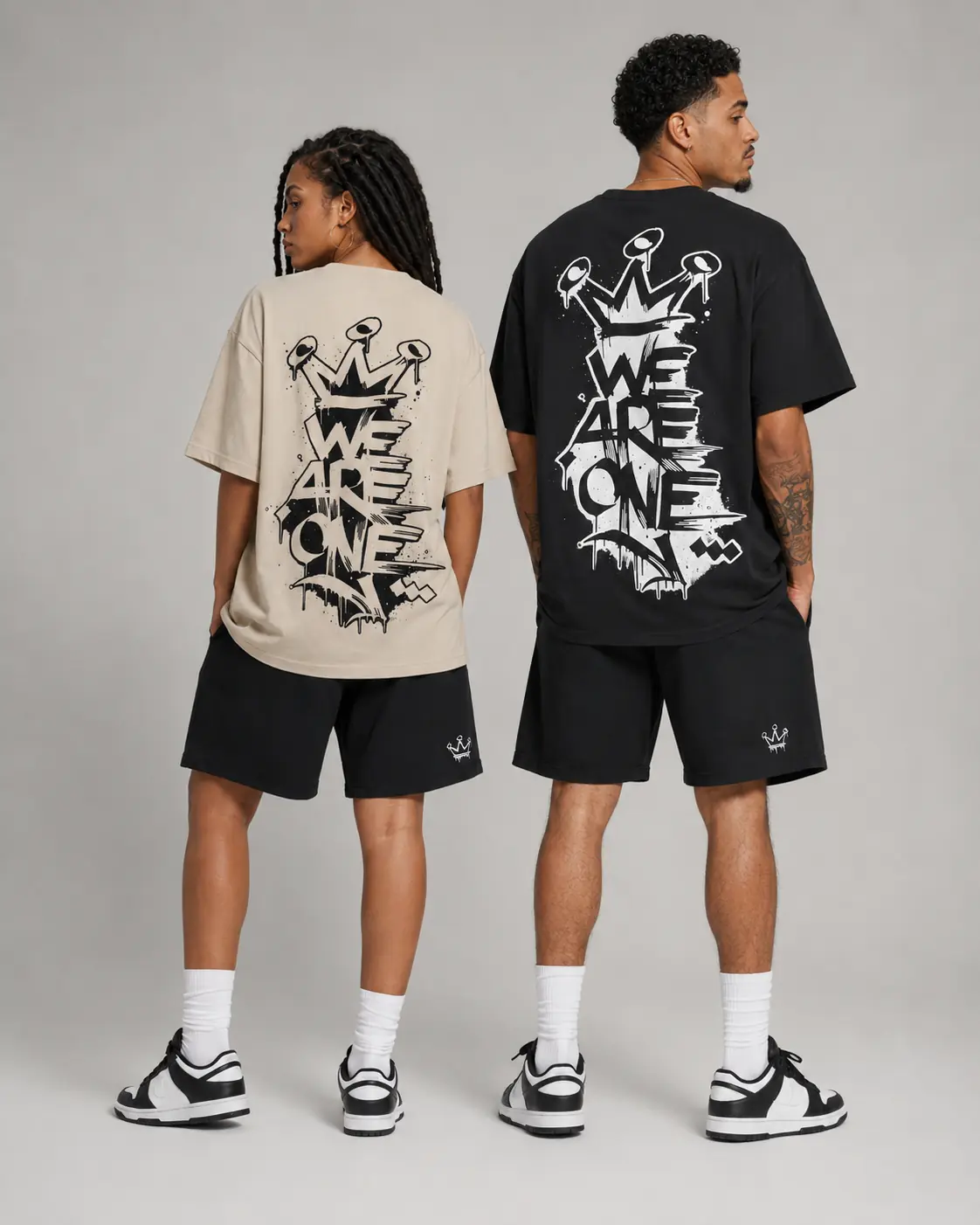
WE ARE ONE — Streetwear T-shirts, back view

WE ARE ONE — Streetwear collection in context
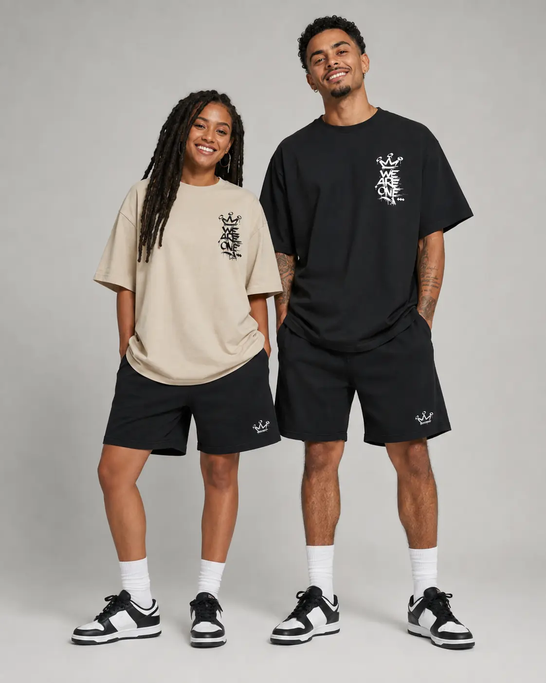
WE ARE ONE — Streetwear T-shirts, front view
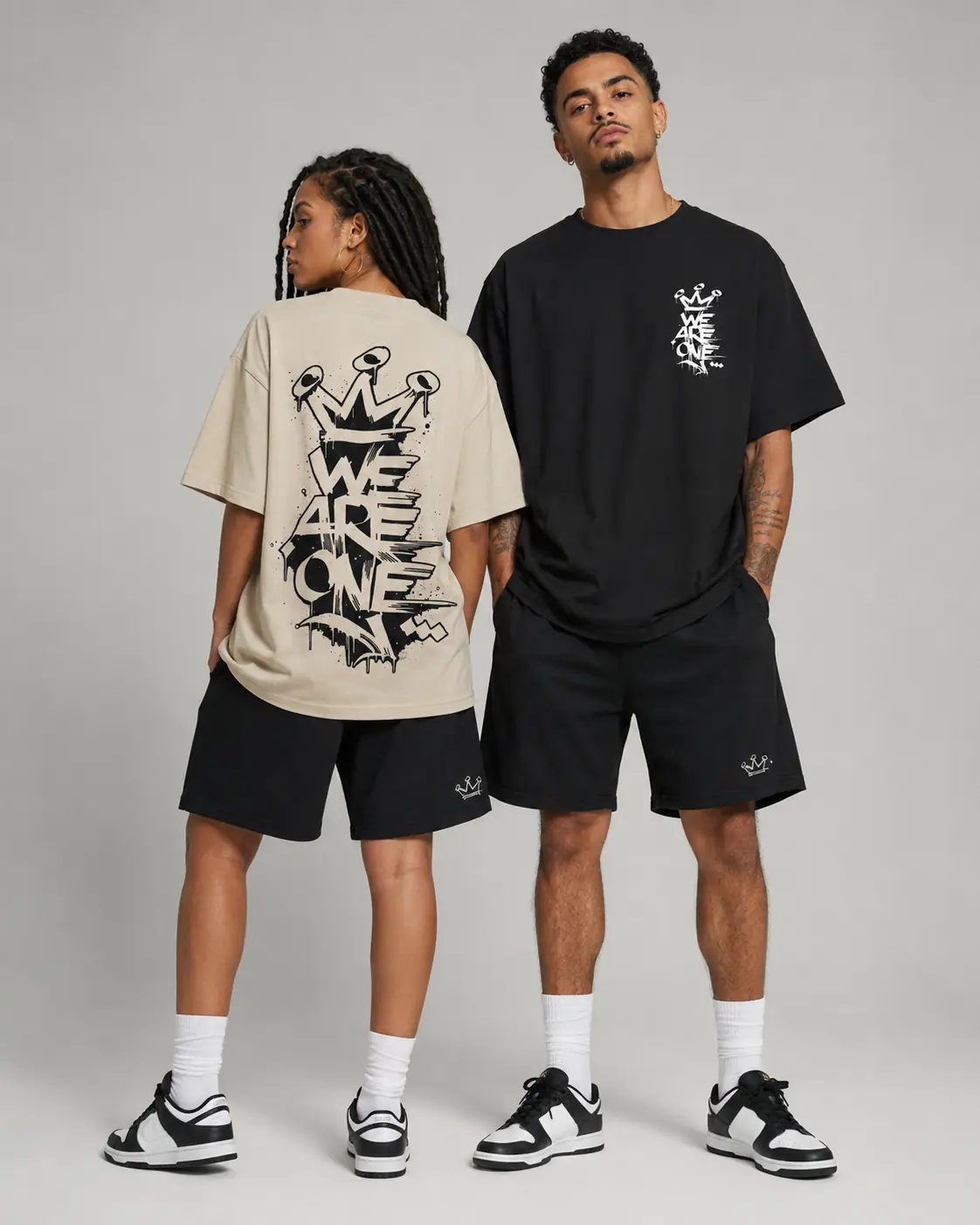
WE ARE ONE — Front and back presentation
Client testimonial
“Ivan perfectly understood our ambition to create an engaged, inclusive streetwear identity that moves away from familiar eco-brand codes. The WE ARE ONE lettering is strong, human and immediately recognisable. The system designed for the back, chest and shorts gives us a coherent identity that is easy to extend across the collection.”
Creator of the WE ARE ONE brand · Owner · WE ARE ONE
Your project