
Visual identity · Dating application · Digital product
REAL LIFE
Identity design for REAL LIFE, a mobile-first dating application currently in development for love and deep friendship. Its Inner Portrait reveals values, aspirations and ways of connecting before appearance, at the pace of trust and consent.
The brief
Create the visual identity of a dating application that helps people discover what connects them first: their values, aspirations and ways of building relationships.
The intention
Give form to an experience based on inner identity, reciprocity and consent without repeating the interchangeable codes of appearance-first platforms.
The visual response
A heart drawn as two links meeting in one continuous line, suggesting attachment, a handshake and resonance between two paths. The rounded wordmark feels gentle and contemporary; REAL and LIFE share the same width, while the red IF introduces possibility and a spark.
The outcome
A compact, warm and immediately legible identity designed for the mobile icon, interface and communications. The functional prototype is currently in development and being tested with early users.
- Concept and graphite research
- Symbol and wordmark
- Typographic system
- Black-and-white variants
- Application icon
Meet what connects you first
The symbol brings heart, connection and reciprocity together in one continuous line. The thin rounded signature balances gentleness with precision. Within LIFE, the red I and F isolate IF: the possibility of a meeting that begins differently.
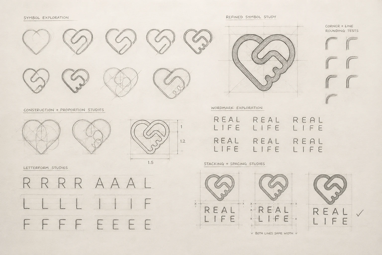
From connection to symbol
Early sketches explore the meeting of two forms: the heart, immediately linked to attachment, and the connecting line, suggesting trust, reciprocity and commitment. Typographic studies then refine curves and spacing so REAL and LIFE share exactly the same width.

Black on white
The light version preserves the drawing’s finesse and the impact of the red IF. The mark remains crisp, accessible and immediately recognisable across interfaces, documents and light backgrounds.
White on black
On black, the white line gains presence without losing its softness. Red becomes a lively point of tension designed for the digital environment and application icon.
Client testimonial
“Ivan translated the intention behind REAL LIFE into an instantly meaningful symbol: two links coming together to form a heart. The logo perfectly expresses connection, reciprocity and the trust at the centre of the application. It feels gentle, modern and immediately recognisable — exactly the image I wanted for the project.”
Anaïs Loewinski · Founder of REAL LIFE · REAL LIFE application
Your project