SAOYA · Brand identity · Jewellery
SAOYA en Provence
A new visual identity for SAOYA en Provence, founded in 1991. The jewel-rose symbol connects the house’s founding gesture—a real rosebud preserved in resin—with the historic rose cut of a diamond.
The brief
Redesign the identity of a jewellery house founded in 1991 without erasing its history, Provençal roots or the personality of its collections.
The intention
Reveal the existing link between SAOYA’s founding rosebud, the material itself and the history of jewellery rather than inventing an unrelated new story.
The visual response
The jewel-rose fuses a rosebud with a rose-cut diamond. Its eight-petal construction becomes the origin of a complete symbol, wordmark, palette and typographic system.
The outcome
A more coherent and lasting identity that turns SAOYA’s heritage into a flexible brand language without flattening the richness of its collections.
- Existing identity audit
- Jewel-rose concept
- Wordmark and symbol
- Collection palettes
- Typographic system
- Essential brand guidelines
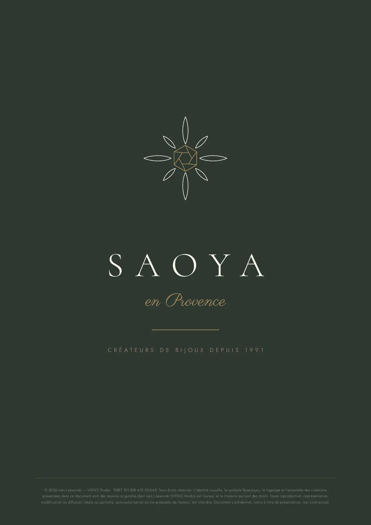
SAOYA en Provence — The essentials
The opening board establishes the new territory: a restrained presence, deep ink green and a signature connecting the house with its Provençal roots.
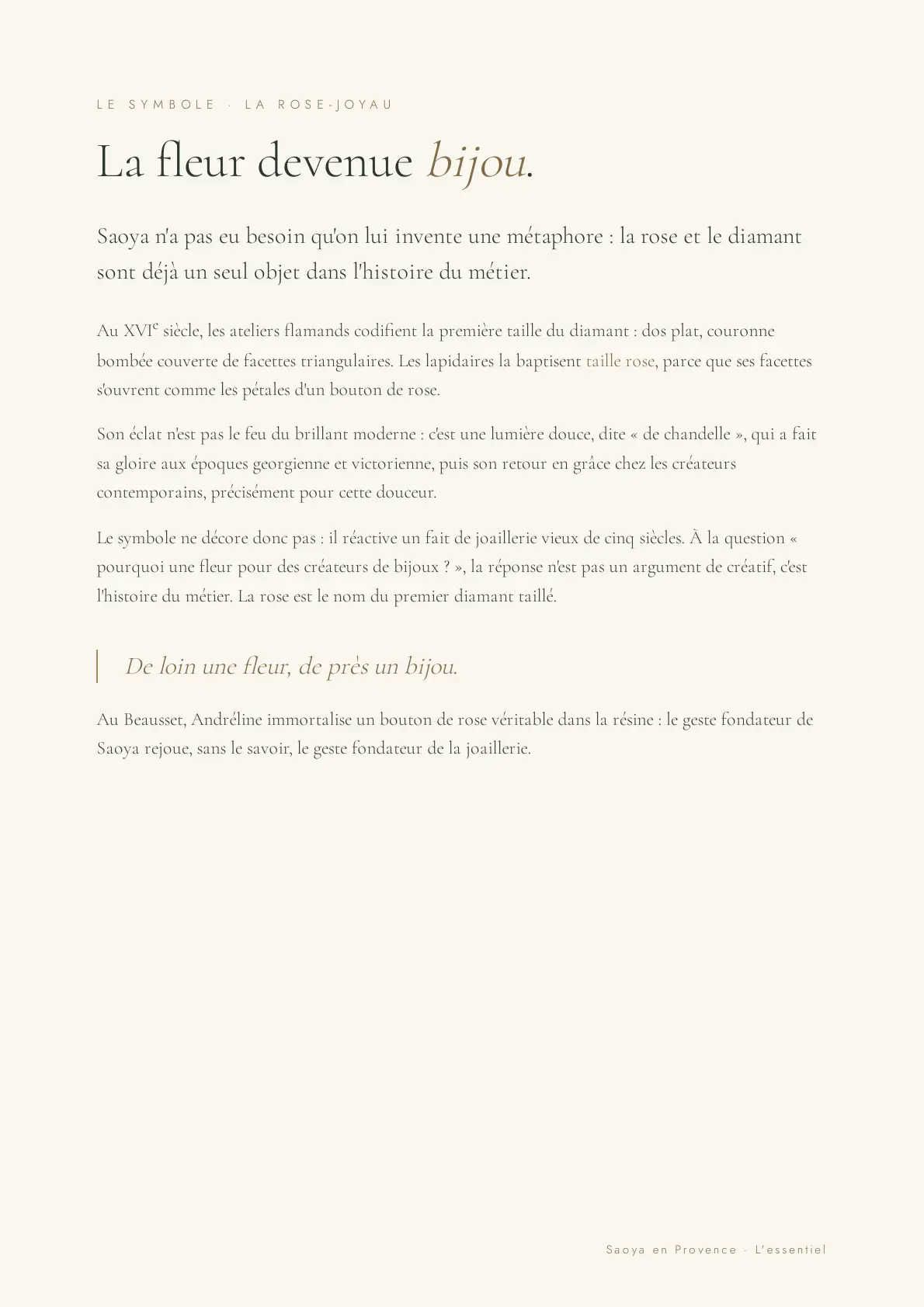
A flower transformed into a jewel
The concept is not based on a decorative metaphor. It connects the rosebud at the origin of the house with the historic rose cut of a diamond.
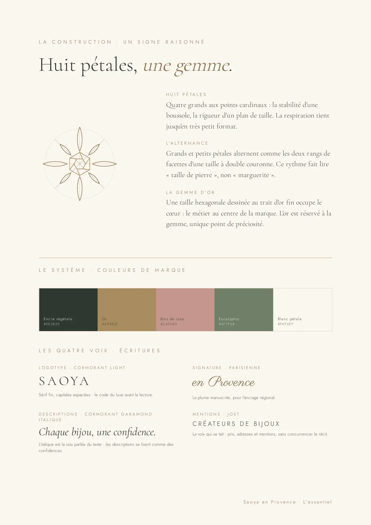
A reasoned symbol
Eight petals, a central gemstone and a rhythm designed to remain legible at every scale. The brand palette and four typographic voices extend the same search for balance.
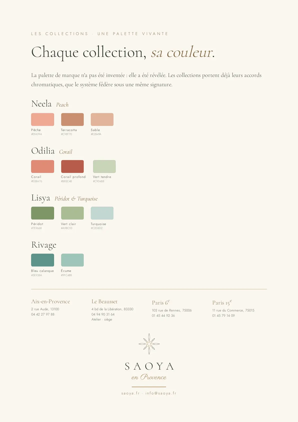
A living palette
The system brings each collection’s colour combinations together under one signature, giving every world its own character while maintaining immediate consistency.
Client testimonial
“Ivan transformed our heritage into a contemporary brand system without erasing our story. The jewel-rose has become a relevant, elegant and flexible symbol for all our collections.”
SAOYA · Jewellery house · since 1991 · Visual identity redesign
Your project