
Visual identity · Restaurant · Calligraphy
Qalam
A more premium identity for Qalam restaurant that preserves the warmth of its cultural roots. The hand-drawn wordmark connects the qalam—the reed pen of early scribes—with culinary transmission.
The brief
Reposition the restaurant within a more premium register while preserving the warmth and roots of its Eastern cuisine.
The intention
Build a meaningful connection between the qalam, the reed of the first scribes, and the transmission of a culinary tradition.
The visual response
A hand-drawn signature enriched with a tajine and ornaments, deployed in black and gold and extended into a bilingual storefront composition.
The outcome
A delivered identity that elevates the perception of the venue, gives meaning to its name and remains instantly recognisable from the street.
- Brand concept
- Calligraphic research
- Final wordmark
- Palette and ornaments
- Bilingual storefront composition
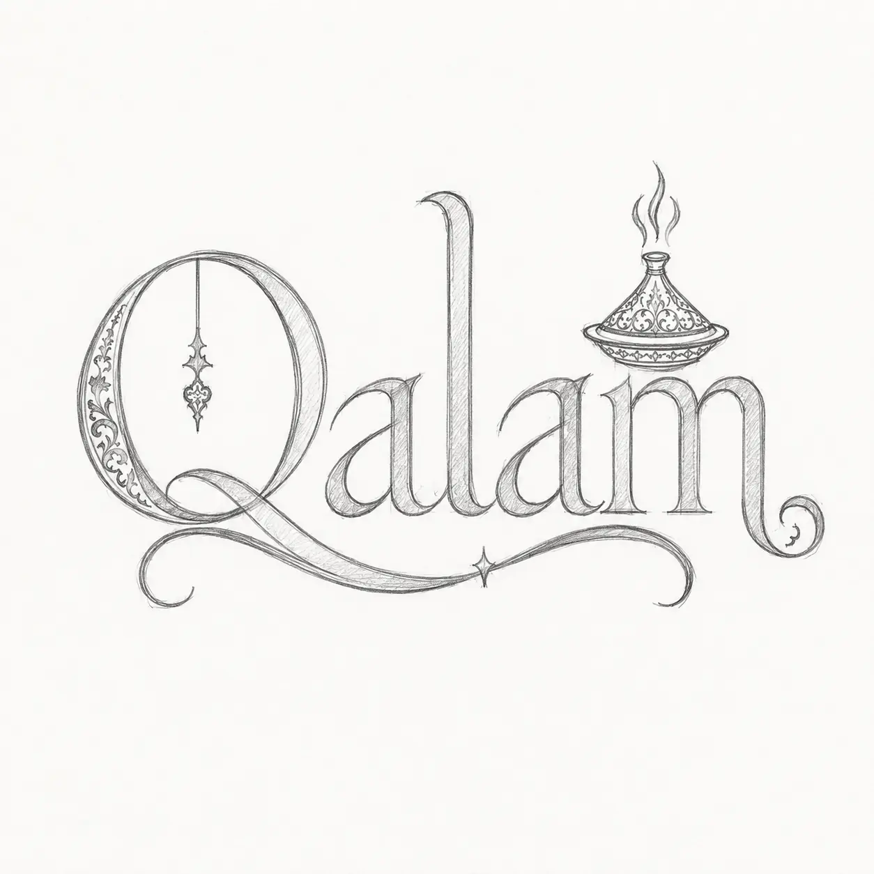
Pencil research
The project starts by hand. Letter proportions, connections and the integration of the tajine are explored in pencil before refinement.
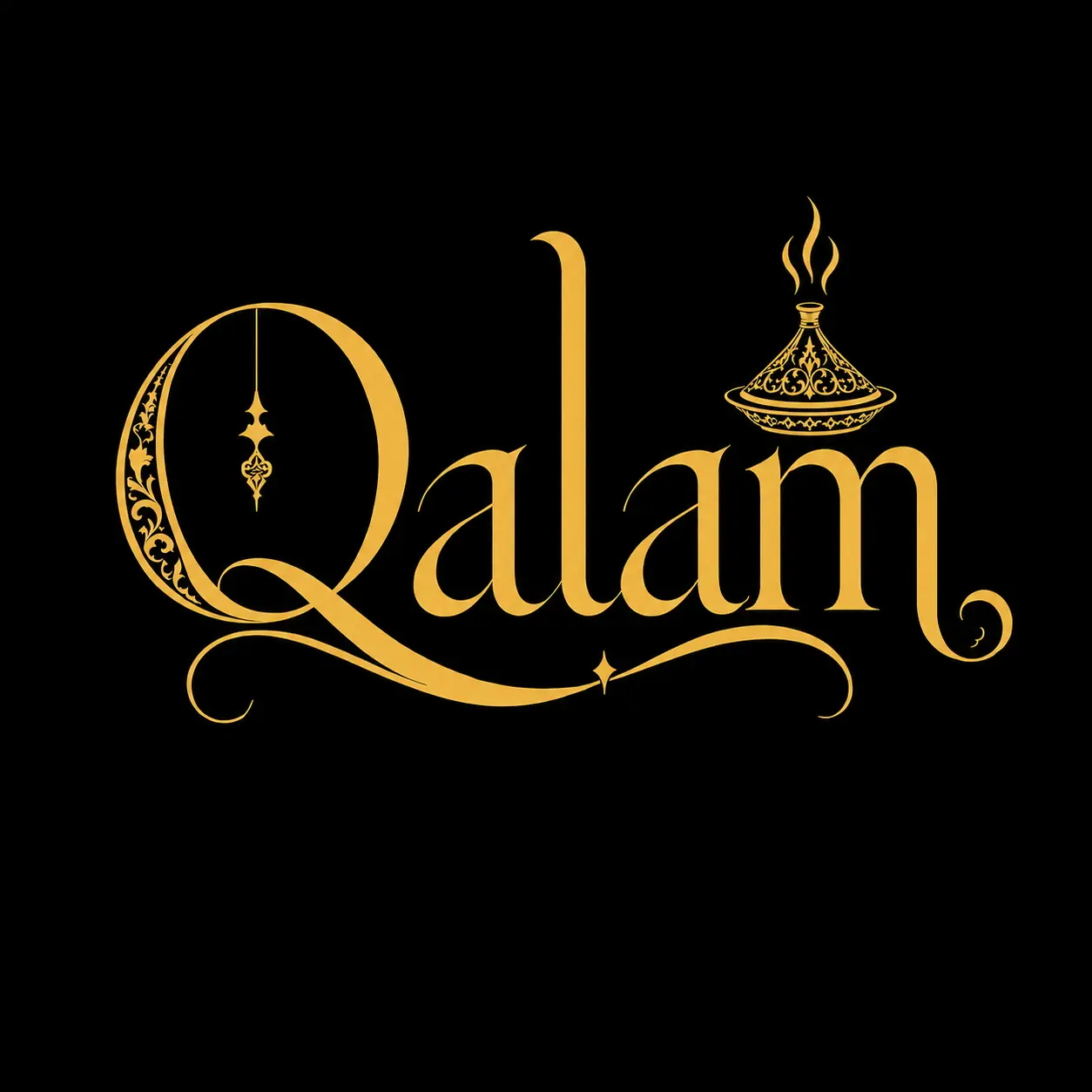
The final wordmark
The final version retains the energy of the original gesture while gaining precision and legibility. Gold conveys craft and premium quality; black strengthens the mark’s presence.
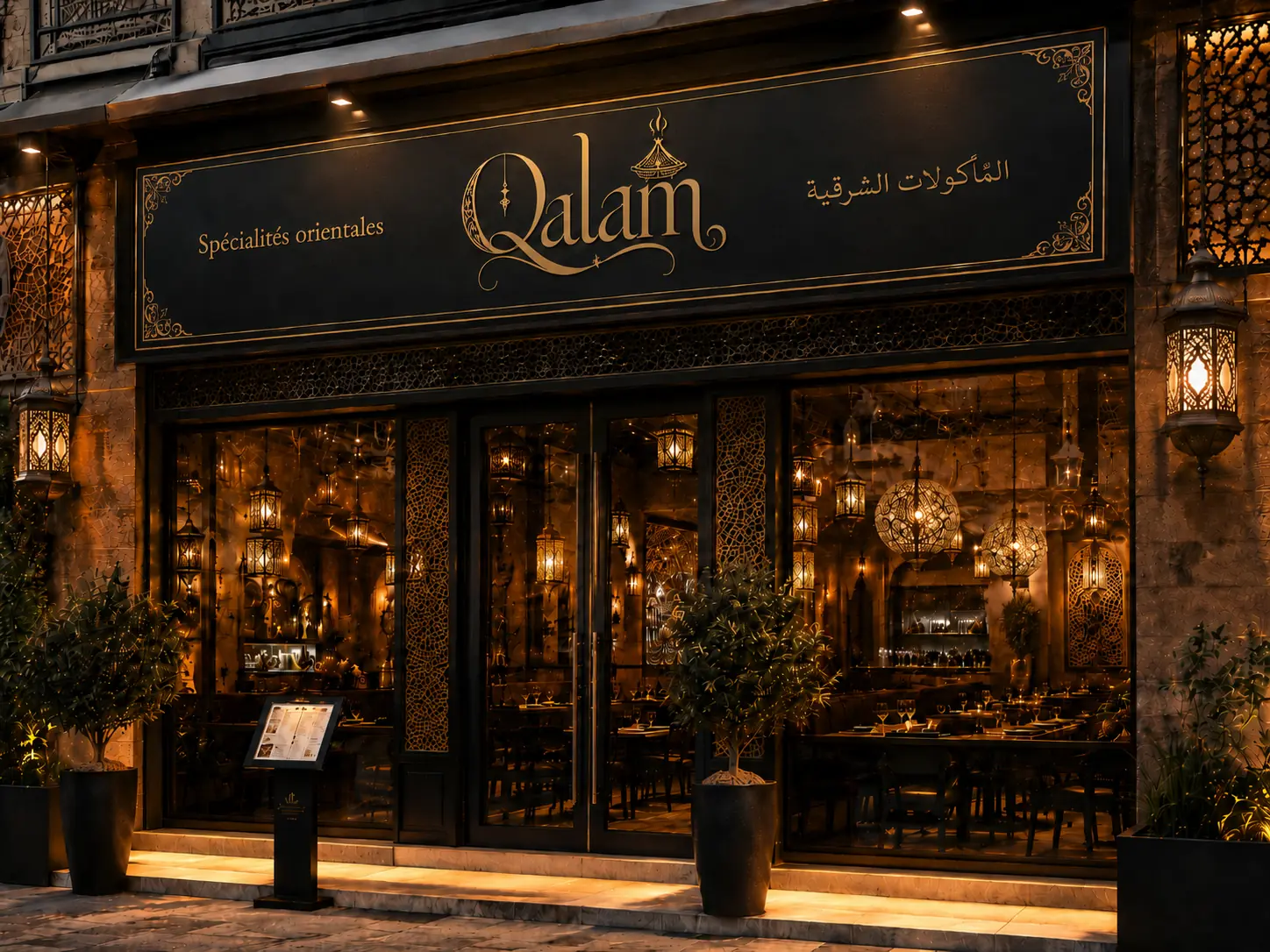
Identity in space
A bilingual storefront uniting the wordmark, the words “Eastern Specialities” and their Arabic translation within one coherent visual architecture.
Client testimonial
“The new identity elevated the restaurant’s image while respecting its soul. The connection between writing, gesture and our cuisine now brings much more meaning to our brand.”
Qalam · Restaurant management · Visual identity and storefront
Your project